

Improving the Upgrade Experience in Mural
the problem:
The current checkout experience in Mural relies on outdated technology, limiting our back-end infrastructure and hindering scalability. These limitations prevent us from accepting crucial payment types, including bank transfers, which is essential for growing our online self-serve business. Additionally, the unclear hierarchy and multi-page steps in the existing checkout process resulting in high drop-off rates.
goal:
Our goal is to redesign the checkout flow to modernize the process, create a seamless user experience, and optimize scalability. This will open new opportunities to expand our online self-serve business and support future capabilities.
role:
Lead Product Designer
Team:
Murali Kundasi, PM
Avi Warner, Eng Manager
Ryan Campbell, Staff Eng
Michaël Pham, Staff Eng
Zach Brandt, Senior Eng
Alex Moreno, Staff Data Analyst
Kevin Manning, Content Designer
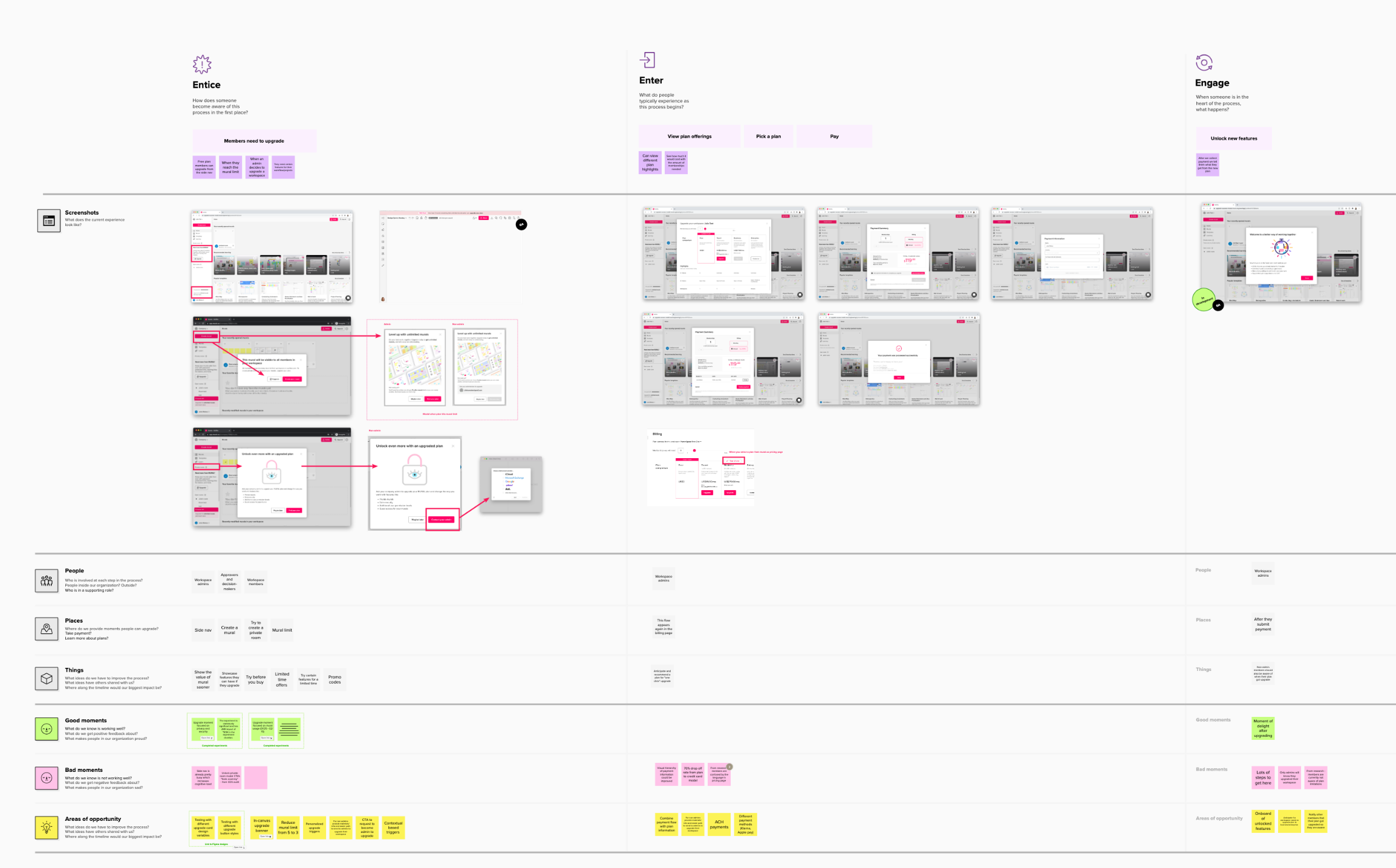
Current upgrade journey
Starting with a user journey map helped me visualize the current user experience, highlighting pain points and areas of opportunity. This provided a holistic, end-to-end view of what our customers are experiencing, helping us identify any gaps or overlooked aspects.
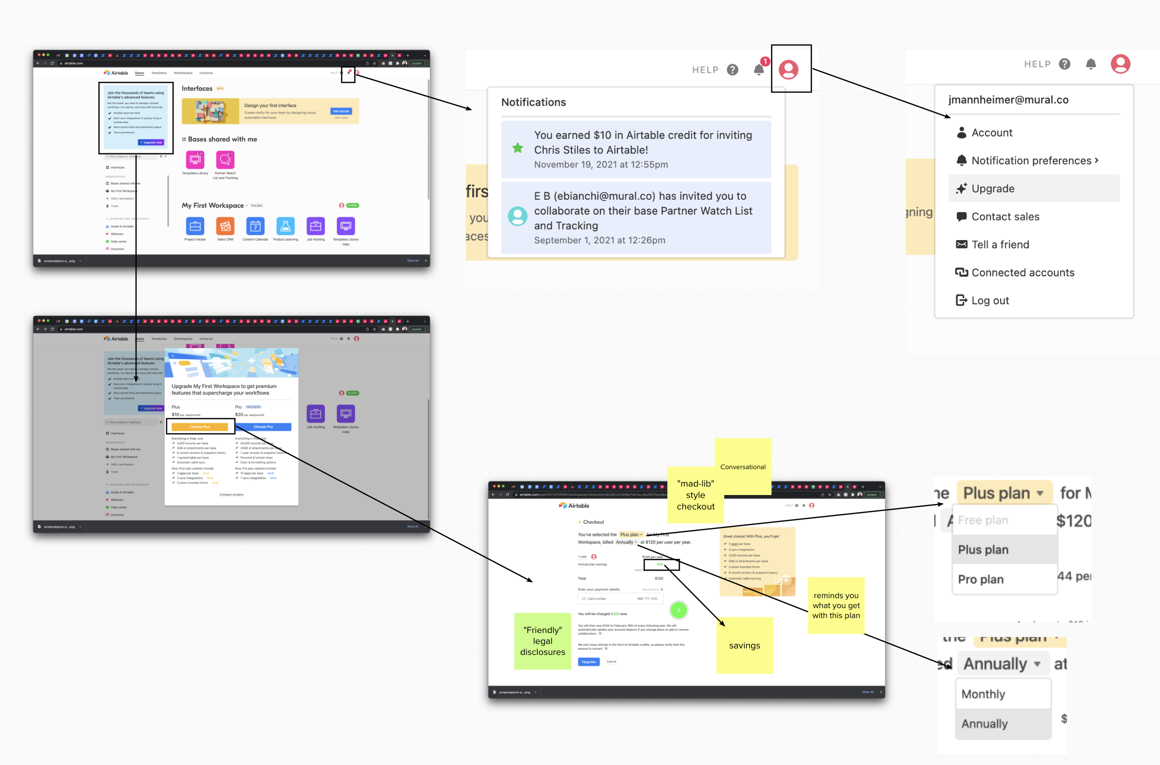
Competitor analysis
Between the Product Manager and me, we reviewed over 10 product companies and collected screenshots showcasing user flow experiences from various upgrade scenarios leading up to the final purchase stage. This documentation was invaluable when discussing design and legal trade-offs during design iteration reviews with the legal team.
Themes identified:
Most had three steps or fewer to upgrade
Split view of payment details and summary
Humanized approach rather than transactional
Clear call-to-actions
The design process
An example of the many design reviews with the design team, stakeholders and engineers.

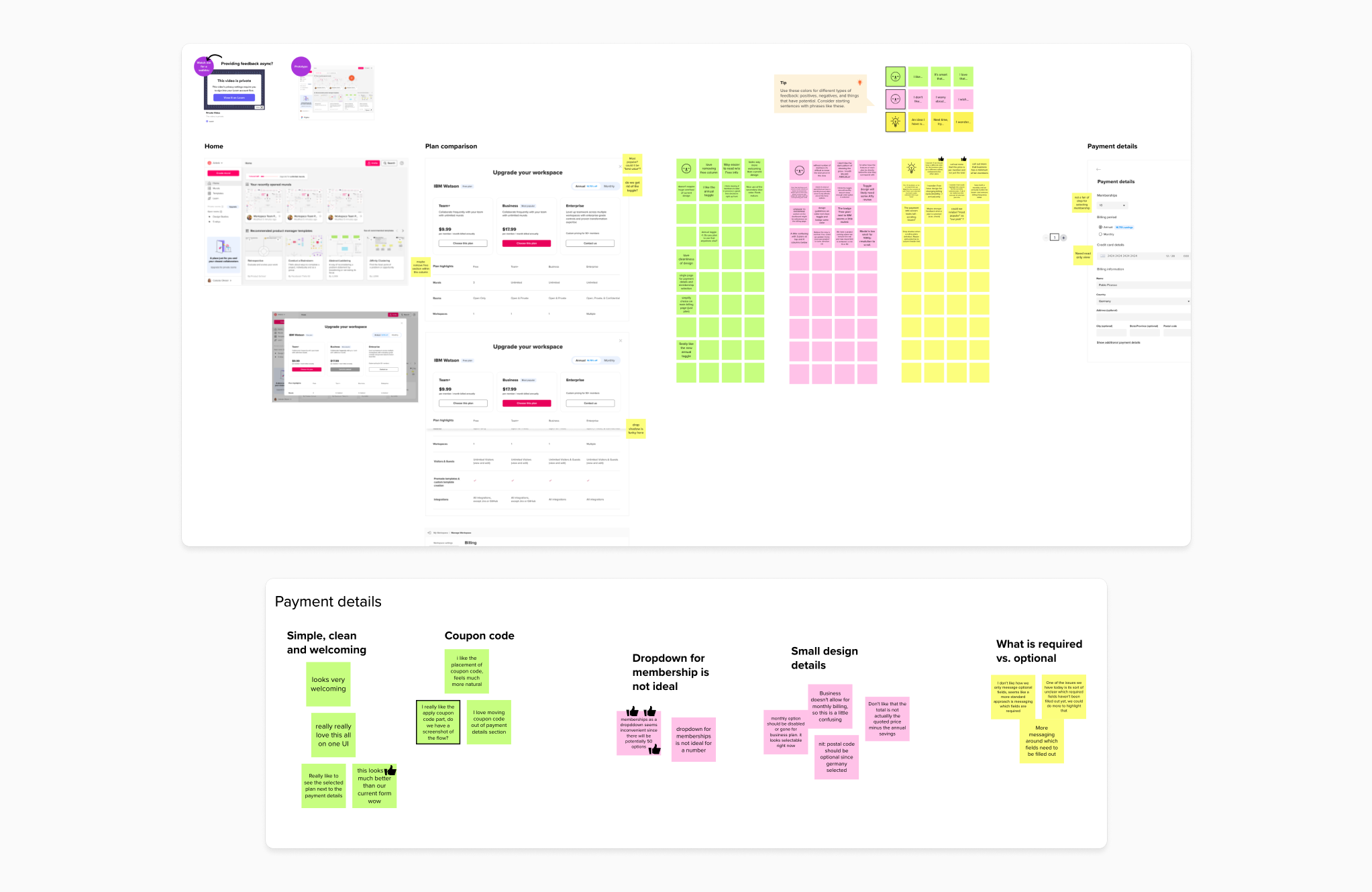
Usability testing
After many design reviews with the team, each time I had them tested with users to validate the direction we were heading in.
Findings:
People expected to be able to upgrade under the workspace dropdown or profile dropdown.
There’s too much scrolling to compare plans.
This purchase flow was as expected and it was clear on how to move to the next step.
Plan comparison could make a stronger case at upselling why one plan is better or different.
Prorated cost A/B testing
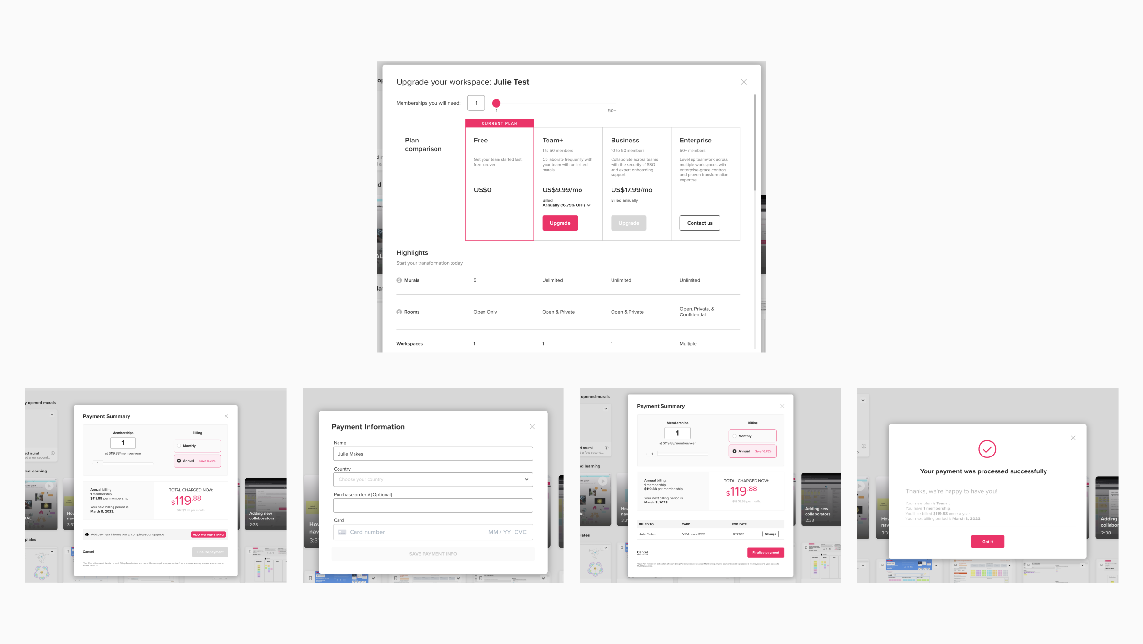
During the design process, I encountered a challenge that I ultimately decided should be tested with users. The goal was to ensure that when people added members to a current plan, the flow was as clear as possible to prevent any deceptive patterns. I conducted a quick and scrappy A/B test comparing two designs: Design A, which included the prorated price in-line, and Design B, which displayed the prorated price as a separate line item.
Design A performed slightly better, as this display was expected by people who manage plans for their company.
Findings:
It’s important to show how many memberships you have and what you are currently paying for.
Everyone understood the proration is based on the days remaining left in the billing cycle.
Including the prorated breakdown would need to be more detailed.

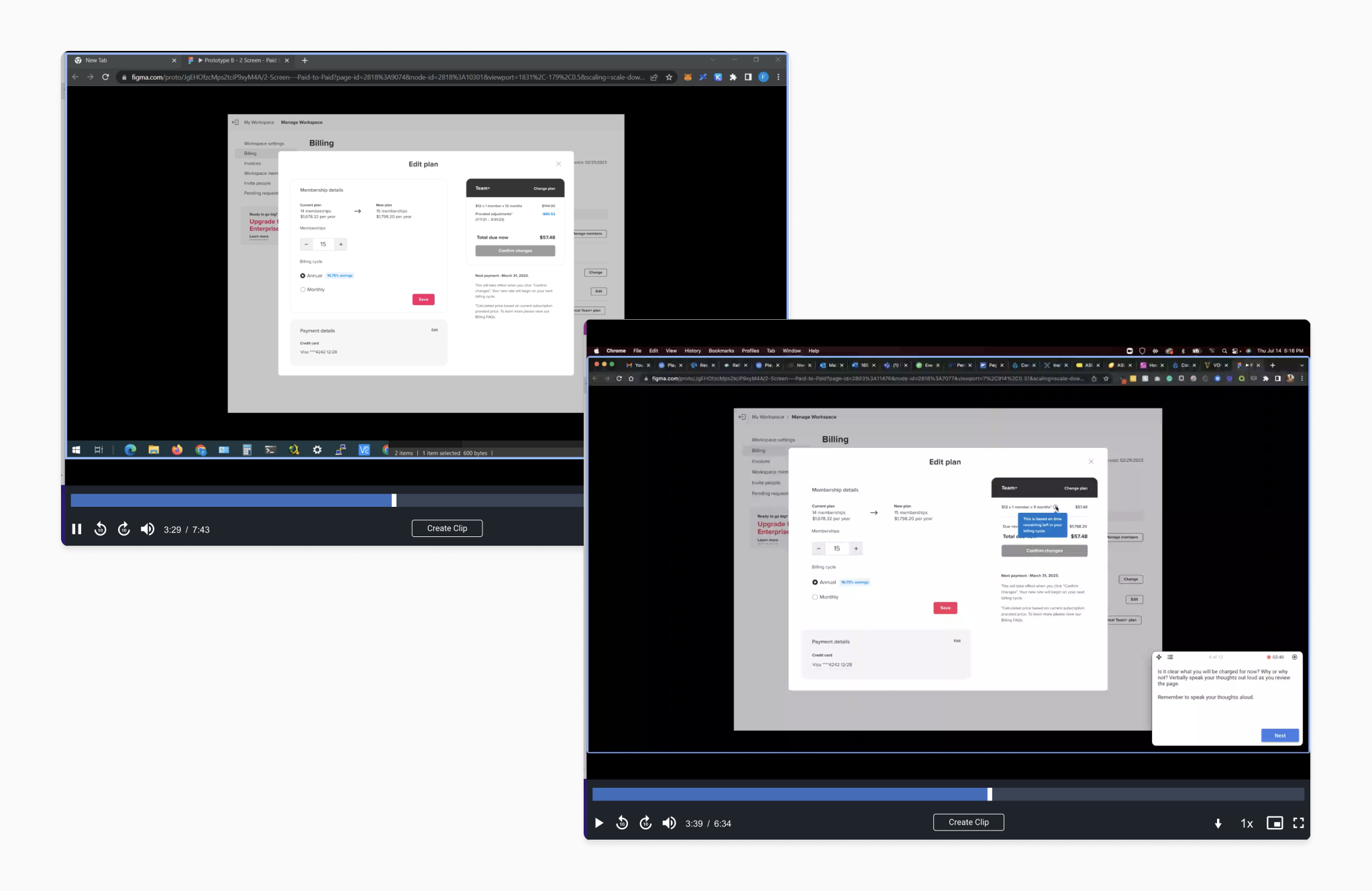
Constraints and trade-offs
While collaborating with the engineers on the new Stripe integration, we faced a constraint: making a 'subscription call' on the back-end before the user entered their credit card information. This required us to separate the purchase flow into multiple steps to gather membership seats and plan type information. My goal was to maintain a seamless experience with fewer clicks and screens.
Final solution:
After design reviews and additional user testing, I separated the membership and payment details into two sections. Feedback indicated that the previous design's single call-to-action in the right summary panel was too far from the user’s point of action. To address this, I moved the 'next' call-to-action closer to each section, facilitating smoother user progression through the necessary steps.
Upgrade flow redesigned


Results
We streamlined the process by reducing the number of screens, enhancing information architecture and content, ensuring legal compliance, and rebuilding the back-end for future scalability. As a result, we met our key result goal of increasing the purchase flow conversion for 30-day workspace creation from 58% to 75%.
*Data collected from July 2022 to December 2022
Impact of this work
We launched 3D secure payments shortly after in August 2022, improved tracking and error display for payments, and introduced the option to pay by invoice. While drop-off rates remained the same through the end of year post launch in 2022, we worked on abandoned cart lifecycle emails. This project enabled further business scaling, including launching more experiments to enhance the plan comparison page and made improvements to the billing and invoices settings page.